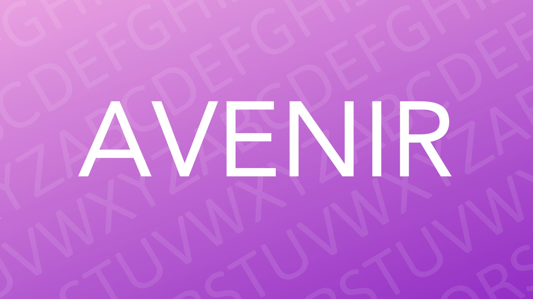
Avenir is a typeface that stands out for its clean, modern look. Designed by Adrian Frutiger in 1988, Avenir is known for its geometric sans-serif style. Many brands choose Avenir because it offers a perfect balance between readability and contemporary design.
In the world of typography, Avenir is admired for its versatility and subtle elegance. The font combines features of the early 20th-century geometric styles, inspired by fonts like Erbar and Futura. This makes Avenir a timeless choice for both digital and print media.
Avenir’s design includes a wide range of weights and styles, increasing its flexibility for designers. Its harmonious blend of organic and geometric shapes allows it to be used effectively in various contexts, from display texts to body copy. This adaptability ensures that Avenir remains a popular choice for designers around the globe.
A Brief History of Avenir
Avenir is a well-known geometric sans-serif typeface designed by Adrian Frutiger in the late 20th century. It was created to blend elements of classic font design with modern touches, and it has seen significant evolution since its release.
Designer Adrian Frutiger
Adrian Frutiger was a Swiss typeface designer born in 1928. He made major contributions to typography, including the creation of popular typefaces such as Univers. His work was characterized by clarity, precision, and a human touch. Frutiger was passionate about simplicity and legibility, factors which greatly influenced his designs. Among his many works, he regarded Avenir as a personal masterpiece due to its elegance and functional design. He made Avenir when he was already an experienced designer, bringing all his knowledge into this typeface’s creation.
Inception and Design Philosophy
Avenir was designed between 1987 and 1988 and released by Linotype GmbH. Frutiger aimed to create a modern equivalent to older geometric fonts like Futura. His vision was to craft a font that balanced geometry with harmony and rhythm. The name “Avenir” means “future” in French and reflects the typeface’s forward-thinking design. Its geometric roots are seen in its circular shapes. However, Frutiger introduced variations in stroke thickness and letter spacing to add a more human feel. This philosophy allowed Avenir to stand out among other geometric sans-serifs, providing readability without losing its modern edge.
Evolution of the Typeface
Since its release, Avenir has evolved to include a wide range of weights and styles. Initially, it included three weights with matching italics. Over time, it expanded to a full family to meet diverse design needs. Used in various mediums from print to digital, it has become a staple for graphic designers worldwide. The design community often praised its versatility and elegance. This has led to its use in prominent publications, corporate branding, and public signage. The typeface maintains its reputation as a go-to choice for those seeking a clean and timeless look. It remains relevant decades after its creation, embodying Frutiger’s vision.
Design Characteristics
Avenir is a geometric sans-serif typeface known for its clean and elegant design. It harmoniously blends the aesthetics of typography and practical application, making it popular for a wide range of uses. Below are the defining elements that make Avenir stand out in the font world.
Distinctive Features
Avenir’s design is heavily influenced by geometric shapes, particularly circles. This gives it a clean and modern look. Designer Adrian Frutiger aimed to create a more organic expression while maintaining the geometric foundation typical of 1920s typefaces like Futura. The result is a typeface that feels balanced and sophisticated.
The rounded forms and precise spacing contribute to its unique appearance. Avenir is often chosen for its futuristic feel, as reflected in its name, which means “future” in French.
Font Family and Weights
Avenir boasts a versatile font family with a variety of weights and styles. It includes options such as Light, Regular, Medium, Bold, and Black, providing flexibility for designers. Additionally, it offers italic styles that add depth to the design possibilities. The availability of condensed versions further expands its versatility, catering to different design needs, whether in print or digital media.
Its comprehensive range allows it to excel in both headline and body text applications. This flexibility makes Avenir a favorite choice for projects requiring consistent visual impact and readability.
Legibility and Readability
Avenir is praised for its legibility across different sizes and displays, making it suitable for various uses. Its clean lines and well-proportioned letters make it easy to read, whether in a headline or body text. The spacing between characters is thoughtfully designed to enhance clarity, especially at smaller sizes.
This typeface is popular in both print and digital formats, owing to its readability and appealing aesthetics. Designers favor Avenir for projects where clear communication and style are equally important.
Usage and Applications
Avenir is a versatile font with many uses, ranging from corporate branding to user interface design. Its clean lines and modern appearance make it a favorite among designers and companies looking to convey a professional and inviting image.
Branding and Corporate Identity
The Avenir font family is often chosen for branding because of its sleek, modern look. Its variety of weights and styles helps companies create a distinct visual identity. Designers appreciate its readability and aesthetics, which communicate professionalism. Avenir suits both logos and corporate materials.
Using Avenir can make a brand appear forward-thinking and reliable. This is why many companies choose it for their core branding elements. Its geometric precision provides a sense of balance and harmony, which is appealing to various industries.
Print and Digital Media
Avenir’s clarity makes it perfect for both print and digital forms. Its use ranges from magazines and brochures to websites and apps. The font’s clean lines and legibility ensure effective communication of messages. This adaptability is one of its most appreciated features.
For digital content, Avenir maintains excellent readability across different devices. It draws from the geometric sans-serif tradition and resembles fonts like Futura and Erbar, giving it a classic yet modern look fit for contemporary design.
User Interface Design
Avenir plays a big role in user interface design. Its various weights and oblique styles offer a toolkit for designers to create easy-to-navigate interfaces. Designers value Avenir’s clean and minimalistic look, which helps users quickly understand the information presented.
Its flexibility makes it suitable for buttons, menus, and navigation bar text. By using Avenir, designers ensure the interface is both attractive and functional. Its popularity in this field is due to its ability to convey information efficiently, enhancing user experience.
Technical Specifications
Avenir is known for its modern design and versatility, offering multiple options for various uses. Details like file formats, compatibility, and licensing are crucial for those looking to incorporate this font into their projects.
File Formats and Compatibility
Avenir is available in common font formats that are widely used across different platforms. The TrueType (TTF) format is popular for both desktop and web use, offering high compatibility with various systems. Additionally, the OpenType (OTF) format adds advanced typographic features like ligatures and alternate characters, enhancing the design possibilities for users.
The font is compatible with major operating systems like Windows, macOS, and Linux. It integrates seamlessly with popular design software, making it a flexible choice for graphic designers and typographers.
License and Availability
Avenir is available for purchase from several digital font distributors. Licenses are required for both personal and commercial use, ensuring proper authorization and supporting the creators. Depending on the provider, different licensing models may be available, such as desktop, web, and app licenses.
This flexibility allows users to choose a plan that best suits their needs. Some vendors might offer discounted bundles that include multiple weights and styles of the font family. This variety ensures that designers have the right options to meet the demands of their specific projects.
Comparisons and Alternatives
Avenir is a popular geometric sans-serif font, known for its clean and modern look. When comparing it to other fonts, it’s important to see how it stacks up against fonts like Futura and what other similar options are available.
Avenir vs. Futura
Avenir and Futura are both classic geometric sans-serif fonts with a sleek and modern appearance. Futura, designed in the 1920s by Paul Renner, is more rigid with sharper geometric shapes. It is often used for bold designs due to its striking look.
Avenir, created by Adrian Frutiger in 1988, offers a softer and more balanced feel. Its design is less strict and has subtle curves that make it suitable for various text purposes.
While Futura has a more historical and avant-garde edge, Avenir is often preferred for body text. This is due to its readability and pleasant appearance in digital and print formats. Choosing between the two often depends on the tone of the design and the intended use.
Similar Geometric Sans-Serifs
Several fonts are similar to Avenir, each offering unique features. Eau and Montserrat are often recommended alternatives. Eau is favored for its simplicity and elegance, while Montserrat is known for its versatility, making it ideal for both headings and body text.
Nunito is another option that pairs well with informal and friendly designs due to its rounder letters. Bergen Text retains personality with its bouncing style, making it distinct yet similar to Avenir.
These alternatives maintain the geometric qualities of Avenir, providing designers with style options that suit different projects and preferences.
Cultural Impact and Recognition
Avenir has made a significant mark in both popular culture and the design industry. Its influence can be seen in various media and it has received numerous accolades for its design.
Use in Popular Culture
Avenir has been widely recognized in popular culture and appears in a variety of media. This geometric sans-serif typeface is often used in films, television shows, and book covers due to its clean and modern look. Designers choose Avenir for its versatility and timeless appeal, making it a favorite for branding and logos.
Publications and online platforms frequently use Avenir, appreciating its balance between readability and aesthetics. Its design fits well with minimalistic and contemporary themes, which are popular in today’s visuals. This combination has ensured Avenir remains relevant in shifting cultural landscapes.
Industry Awards and Accolades
Avenir has garnered appreciation not only from users but also from design experts. The typeface, created by Adrian Frutiger, received praise for its innovative approach to geometric sans-serif fonts. Its introduction in the late 20th century helped modernize typography with its distinctive style.
Industry awards have highlighted its contribution to graphic design, noting the elegance and functionality of its character set. Typography enthusiasts and professionals value it for its consistency and reliability in various applications, cementing Avenir’s status as a staple in professional design toolkits.
Best Practices
Avenir is known for its clean and modern look, making it a popular choice for both digital and print designs. In this section, you will find tips on using Avenir effectively by choosing the right context and pairing it with other fonts.
Choosing the Right Context
Avenir works best in settings that demand clarity and readability. Its geometric sans-serif design is ideal for branding, web design, and user interfaces. This font adapts well to both headlines and body text, ensuring a visually consistent look. It’s especially effective in tech and fashion industries because of its modern vibe.
When selecting Avenir, consider the medium. Its smooth lines are excellent for screens, so it performs well in apps and websites. Ensure the chosen weight suits the message. Lighter styles like UltraLight give a subtle appearance, while Heavy offers strong emphasis. Match the font’s tone with the purpose, whether professional or creative.
Pairing with Other Fonts
Pairing Avenir with other fonts can create a dynamic look. Avenir, with its geometric shape, complements contrasting typefaces well. For a sophisticated feel, pair it with serif fonts like Times New Roman. This combination balances modernity with tradition.
For a playful effect, mix Avenir with more expressive fonts. A pairing like Avenir and Sunflower adds a touch of fun and energy to the design. Their contrast enhances visual interest. Ensure that text remains legible by sticking to two or three font variations. Consistency is key, so use similar font weights and sizes for a cohesive look.