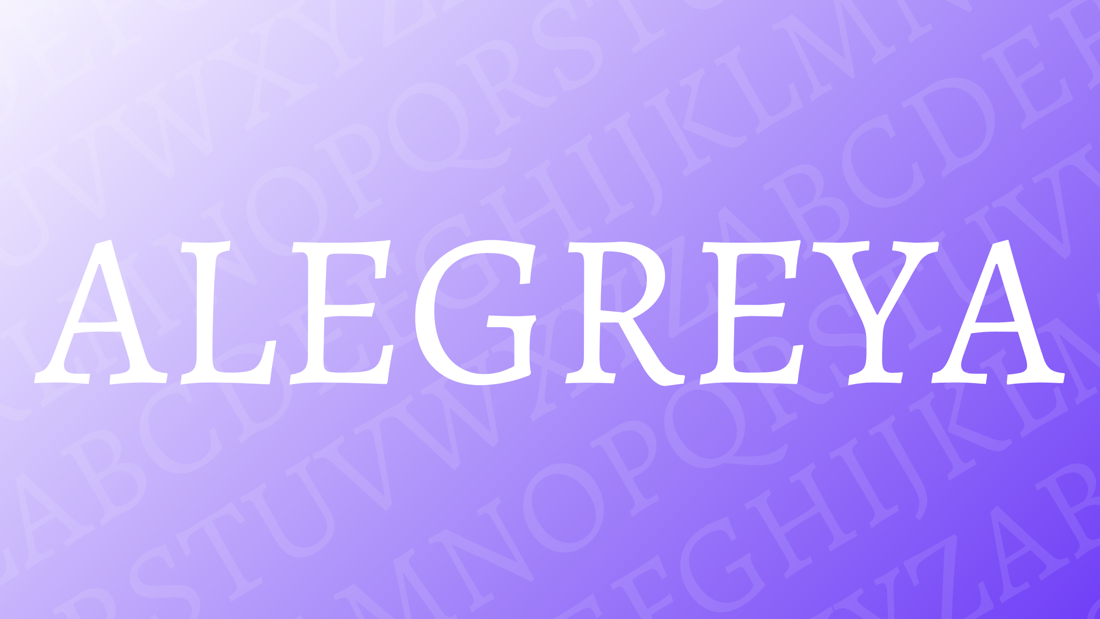
Alegreya, designed by Juan Pablo del Peral, stands out as a typeface crafted with literature in mind. Its dynamic rhythm and varied styles make it a favorite among designers who seek both beauty and functionality in their typography. Chosen as one of the “Fonts of the Decade,” Alegreya offers readers a smooth and engaging reading experience.
With both serif and sans serif versions, Alegreya provides versatility for different design needs. Whether used in marketing graphics, website text, or ebooks, this font can create a visually appealing layout. The serif style, in particular, has gained attention for its classical yet modern look.
Alegreya’s charm goes beyond its aesthetic appeal. It has been recognized in international design competitions, reflecting its significance in the design community. For those looking to enhance their creative projects, exploring Alegreya on Adobe Fonts might just be a game-changer.
History of Alegreya
Alegreya is a serif typeface that was crafted by Juan Pablo del Peral. It was created to enhance the experience of reading long literary texts.
The typeface was released in 2012 and quickly gained attention for its unique charm. Alegreya became a popular choice among designers and readers for its engaging and smooth reading flow.
This typeface draws inspiration from calligraphic styles but presents them in a contemporary way. Alegreya features a dynamic rhythm and versatility which make it appropriate for both traditional and modern uses.
Characteristics:
- Five weights
- Carefully designed italics
- Small caps
- OpenType support
Alegreya’s design allows for a rich typographic palette, offering expressiveness and readability. This combination of classic and fun elements has made it a staple in literary works and beyond.
Whether in print or digital media, Alegreya succeeds in keeping texts both aesthetic and legible. Its adaptability makes it a preferred choice for various design projects, enhancing the experience of readers everywhere. For more details about the font, check out its Google Fonts page.
Design Characteristics
Alegreya is celebrated for its dynamic rhythm and flexibility. It offers a contemporary spin on calligraphy, making it not only stylish but also practical for reading. With its open letterforms and balanced design, Alegreya maintains readability without sacrificing elegance.
One of its standout features is the italic style, which is both unique and well-crafted. This makes the font versatile for various design needs. The carefully designed italics provide a comfortable flow for longer texts, adding an artistic touch to literature.
Alegreya includes a wide range of weights from light to bold, accommodating different design projects. The variety offers designers the flexibility to use it in diverse settings, whether for headlines or body text. Its rich typographic palette sets it apart from many other fonts.
The design involves subtle calligraphic elements, evident in the slight variations of line thickness. This feature gives it a gentle and appealing character while keeping it grounded in tradition. The open letterforms and moderate contrast make it adaptable to both digital and print media.
For designers looking for a typeface with a humanistic touch, Alegreya Sans is an excellent choice. It incorporates a similar feeling with slight differences in strokes and proportions. A visit to Beautiful Web Type hints at its use in long-form texts, enhancing readability.
Notably, Alegreya is licensed under the SIL Open Font License, as highlighted on Fontforge. This allows for broad usage, including study, modification, and sharing, making Alegreya a popular choice in the design community.
Font Family and Variations
Alegreya offers a diverse font family that provides flexibility for various design needs. With styles like Alegreya Sans, Italic, and Small Caps, it ensures readability while maintaining a stylish aesthetic.
Alegreya Sans
Alegreya Sans is a versatile style that enhances readability without sacrificing elegance. It’s a part of the super family, designed to work well for both text and display uses. This style removes the serifs found in the original Alegreya, offering a cleaner and more modern look.
The simple character shapes of Alegreya Sans make it ideal for digital interfaces and print media alike. It features a dynamic appearance, suitable for projects that aim for a contemporary feel while retaining classic qualities. Designers can experiment with weights and sizes to create visually interesting layouts.
Alegreya Italic
Alegreya Italic adds a touch of sophistication with its slanted letters and graceful curves. This variation maintains the rhythmic flow of the original Alegreya, ensuring that it remains easy to read even in lengthy passages.
Its design is particularly suited for emphasis in text, such as book titles or quotes. The Italic version keeps the dynamic nature of Alegreya, allowing for a seamless combination with other styles in the family. Designers often use Alegreya Italic for projects where elegance and readability are essential, like greeting cards or headings.
Alegreya Small Caps
Alegreya Small Caps provides stylistic alternatives for users looking for a unique typographic expression. This version includes smaller uppercase letters mixed with regular-sized lowercase letters, which can be great for headings and subheadings.
The small caps style adds a historical touch to modern designs, reminiscent of early print typography. It pairs well with different weights in the Alegreya family, offering distinct visual hierarchies. By combining with other variations, designers can create layers of emphasis, making text more engaging and refined. This style suits academic or formal documents where clarity and style are both needed.
Usage and Applications
Alegreya is a typeface that stands out for its versatility. It features both serif and sans serif versions, which makes it perfect for pairing in various projects. These include marketing graphics, website copies, and presentations.
In print media, Alegreya is often chosen due to its classic feel and readability. It is especially popular for creating books and magazines. Its unique design and open letterforms make it ideal for long texts.
In digital projects, Alegreya shines in web design. Its balanced design and variety of weights support diverse uses. The font’s subtle calligraphic influence adds a touch of elegance, making it suitable for online articles and digital publications.
Alegreya was chosen as one of the “Fonts of the Decade” and has received recognition in design competitions. This acclaim reflects its excellent utility in both text and display settings.
Here’s a quick look at some features to consider:
- Serif and Sans Versions
- Range of Weights: From light to black
- Good for Print and Digital
Whether it’s for a modern website or a classic book, Alegreya’s flexible design caters to a wide range of needs. Its ability to provide a cohesive look across various media makes it a favorite among designers.
Typography and Readability
Alegreya is known for its versatile use in both digital and print formats. Its design caters to smooth reading, whether viewed on screens or paper. The font’s adaptability makes it a popular choice for various projects.
On Screen
Alegreya is widely appreciated for its readability on screens. Its open letterforms and subtle contrast make it ideal for digital displays. The design includes both serif and sans serif versions, enhancing its flexibility for different digital contexts. Websites can employ Alegreya to create engaging content that is easy to navigate.
The font’s dynamic rhythm ensures that text remains clear, even on smaller screens like smartphones. This quality enhances user experience by reducing eye strain during extended reading sessions. Using Alegreya for online content, ebooks, or blogs maintains clarity and readability.
In Print
In print, Alegreya shines with its calligraphic style and carefully designed italics. This makes it perfect for literary texts and long-form content, as it was originally intended for literature. Its five different weights provide options for varying text emphasis and style needs.
With a balance between thick and thin strokes, the font adds a level of sophistication to printed materials. Designers appreciate its versatility across different mediums, often choosing it for novels, magazines, and poetry collections. Alegreya’s expressive typeface can give printed projects a refined and professional appearance.
Technical Specifications
Alegreya is a serif typeface designed to support a variety of uses, especially in literature. It features a versatile design with different weights and styles.
- Weights: Five weights are available. This makes it adaptable for various design needs.
- Styles: Includes both regular and italic versions.
- Formats: Supports several font formats for different applications.
Alegreya’s typographic palette offers small caps and good OpenType support, enhancing its flexibility. The design supports a wide range of characters and glyphs, ensuring it works well for diverse texts.
The font family provides a number of styles to choose from. There are ten styles available through platforms like Adobe Fonts, making it easy to integrate into any design workflow.
Created by Juan Pablo del Peral, Alegreya was initially intended for literary works. Today, it is widely used by designers for its readability and expressive qualities. You can find additional details on its features and download options on sites like Google Fonts.
Alegreya is appreciated for its calligraphic roots and its ability to maintain clarity in both digital and print media. Whether used in books or websites, its adaptability makes it a popular choice among designers and readers alike.
License and Availability
Alegreya is available under the Open Font License (OFL). This license encourages the global development of collaborative font projects, allowing free use and modification. Users can share and enhance the font, which makes it ideal for use by academic and linguistic communities. For more details, check the Open Font License.
The font family is accessible through platforms like Google Fonts and Adobe Fonts. On Google Fonts, users can find both Alegreya and its sans-serif sibling, Alegreya Sans. These are easy to integrate into various projects for both web and print.
Adobe Fonts also offers Alegreya with multiple styles for sync and web use. From regular to italic, and bold to small caps, the range provides flexibility for different design needs. This versatility helps designers bring a literary touch to their projects.
Comparison to Other Serif Fonts
Alegreya stands out among serif fonts for its distinctive style and versatility. Its features and design allow it to be compared to many classic serif fonts, each with their own unique qualities and history.
Alegreya vs. Times New Roman
Alegreya offers a more modern and artistic feel compared to Times New Roman. While both are serif fonts, Alegreya has a slight calligraphic touch, giving it a warm and inviting appearance. It’s popular for creative projects that need an elegant yet innovative flair.
Times New Roman is valued for its classic, professional look, widely used in academic and formal documents. It has a more traditional structure, which can sometimes feel rigid compared to Alegreya’s fluidity. In professional settings, Times New Roman remains a staple, while Alegreya appeals to those looking for a more aesthetically intriguing option. For websites or art pieces, Alegreya adds a unique character that Times New Roman might lack.
Alegreya vs. Garamond
Garamond is known for its refined elegance and readability, often used in books and literature. Alegreya, on the other hand, provides a harmonious blend of classic serif principles with contemporary design elements. This mix helps it stand out in modern design spaces.
Alegreya includes both serif and sans-serif versions, offering versatility in digital content. Garamond’s main appeal is its timeless sophistication. While Garamond favors delicate, light strokes, Alegreya’s thicker lines and purposeful contrast invite attention and engagement. This makes Alegreya a suitable choice for branding and advertising where dynamic text presence is crucial. Both fonts are prized for specific traits that attract different audiences and purposes.
How to Install and Use Alegreya
Installing Alegreya is simple:
- Visit Google Fonts.
- Click the “Download family” button for a ZIP file.
- Extract the ZIP file and install by double-clicking the font files.
Alegreya can also be installed through Adobe Fonts. Sync it to your library and use it directly within Adobe apps.
Using Alegreya in Projects:
Alegreya has both serif and sans serif versions, making it versatile. It suits literature and creative works, offering a dynamic rhythm that helps in reading long texts.
Pairing Tips
- Combine the serif and sans versions for a balanced look.
- Use different weights to highlight headings and body text.
Example Styles
Alegreya provides various styles:
- Italics: Offers an elegant touch.
- Small caps: Adds sophistication to titles and headers.
Ideal Uses
- Books and eBooks: Its literary origin makes it fit for reading.
- Marketing Graphics: Perfect for designing engaging materials.
- Presentations: Enhances readability and appeal.
Accessing and Editing:
Alegreya is accessible in desktop publishing software. Modify the weight and size in your chosen program to match your design needs.
By following these steps, anyone can install and use Alegreya to create stunning documents and designs.