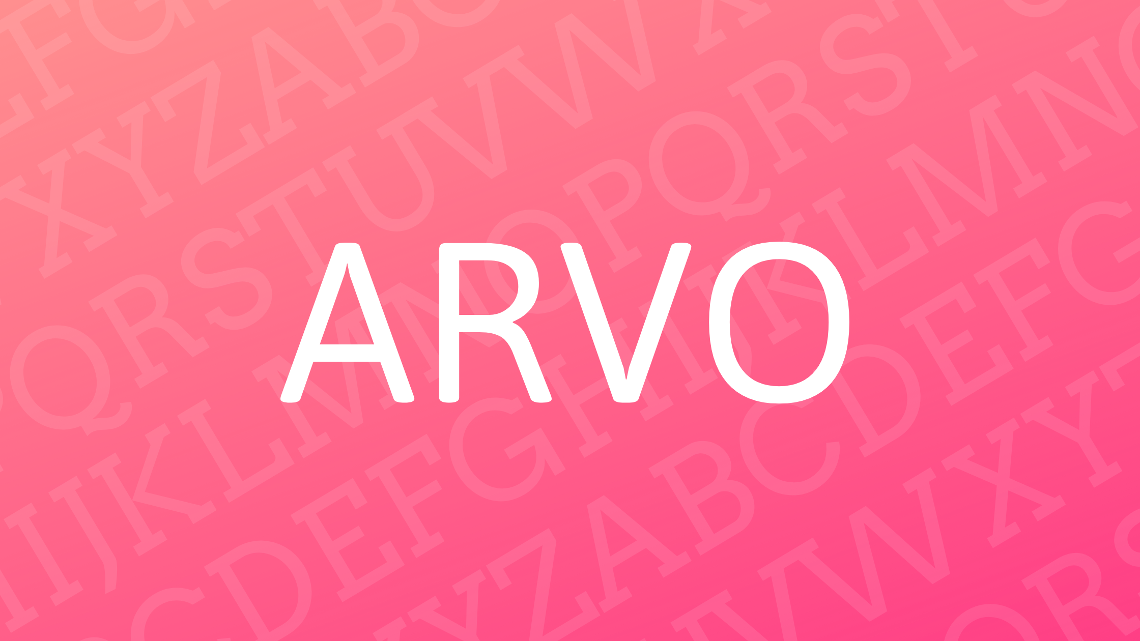
Arvo is a geometric slab-serif typeface that catches the eye with its modern and approachable design. Known for its versatility, Arvo is suitable for both screen and print applications, making it a favorite among designers and typographers. The font family includes Roman, Italic, Bold, and Bold Italic styles, enhancing its adaptability in various projects.
Originating from collaboration between Anton Koovit and Yassin Baggar, Arvo owes its aesthetic appeal to a mixture of classic and contemporary design elements. This blend gives it a unique character, allowing it to stand out in the digital font landscape. Whether used in web design or printed material, Arvo’s clarity and legibility make it a reliable choice.
Arvo’s high x-height and balanced mixture of straight and curved edges contribute to its distinctive look. It’s this combination that makes Arvo a highly readable and visually appealing typeface. For more information on its characteristics, you can explore the FontForge guide to Arvo.
Arvo Font History
Arvo is a geometric slab-serif typeface that stands out for its blend of classic and modern features. This font family, known for its versatility and clarity, brings a modern touch to traditional serif design.
Design Inspiration
The design of Arvo is heavily inspired by geometric shapes, aiming to combine the timeless appeal of serifs with a contemporary edge. This makes Arvo suitable for both print and digital designs, offering a clean and polished look. Its nearly monolinear style contributes to increased legibility, which is especially helpful on screens. What distinguishes Arvo is its mix of straight and curved edges, enhancing readability while maintaining a stylish appearance. It balances traditional serif elements with modern geometric design principles.
Creator and Development
Arvo was designed by Anton Koovit, a designer with a keen eye for approachable and functional typefaces. The font was launched in 2010 and quickly became a favorite due to its adaptability. It includes four styles: regular, italic, bold, and bold italic. Recognized for its modern flair, Arvo was made available as a libre font, allowing wide use without restrictions. The effort put into its hinting process during development ensures clarity and readability, particularly on different operating systems and devices.
Characteristics of Arvo
Arvo is a versatile geometric slab-serif typeface. It’s known for its balanced design, which combines modern and approachable elements. The sections below explore its font family, letterform details, and features enhancing legibility and readability.
Font Family and Weights
Arvo includes multiple styles that offer flexibility for design projects. The font family features Roman, Italic, Roman Bold, and Bold Italic styles. This variety is beneficial for different design contexts like headlines, body text, and digital projects.
Its consistent use across platforms is notable. Being a free and widely available font, it sees application in both print and screen-based media. This range makes it a favored choice for many designers.
Letterform Details
The letterforms of Arvo present a unique blend of classic and modern features. Its geometric slab-serif style gives each character a structured and clear appearance. Designers appreciate its high x-height as this makes individual letters more distinct.
Adding to this are the monolinear lines with slight contrast. These features create a harmonious mix of straight and slightly curved edges. This detail adds a dynamic element to the font while maintaining its structured look.
Legibility and Readability
Arvo boasts excellent legibility, which is crucial for both screen and print usage. The slight contrast in lines enhances visibility, particularly on digital devices. This can be especially beneficial when viewed on platforms like Mac OS X.
Its design ensures clear text presentation even at smaller sizes. The slab-serif elements contribute to the readability, giving each character a stable base. These characteristics make it suitable for both titles and body text, offering a smooth reading experience across mediums.
Usage and Applications
Arvo is a versatile typeface with options for both print and digital media. It’s popular among designers for projects ranging from websites to printed materials.
Print vs. Digital Media
Arvo is well-suited for both print and digital formats. Its geometric slab-serif style gives it a clean appearance on the screen, making it ideal for web designs. The monolinear lines and balanced letterforms improve legibility, especially at smaller sizes on digital devices.
In print, Arvo’s classic yet modern look works well for publications that need a professional touch, like brochures and magazines. Designers can utilize styles like Roman and Italic for varied headings and body texts. Its subtle contrast helps it stand out in printed media, ensuring readability.
Popular Use Cases
Designers often choose Arvo for websites because its clean structure provides a polished feel. The font is included in Google Fonts, making it accessible for web development projects. It’s also commonly used in branding efforts that require a modern but friendly voice.
In print, Arvo’s adaptability makes it a favorite for brochures, posters, and marketing materials. Its geometric style can lend a sleek, professional look to business stationery and reports. Designers appreciate the range of styles available, like Italic and Bold, allowing for creative flexibility in various projects.
Technical Information
Arvo is a geometric slab-serif typeface that is both modern and versatile. It is designed to work well in digital and print media, making it a popular choice for various design projects.
File Formats and Compatibility
Arvo is compatible with many file formats, which makes it easy to use across different platforms. Common formats for Arvo include TrueType (.ttf) and Web Open Font Format (.woff), ensuring it works for both desktop and web applications.
Being a part of the Google Fonts library, Arvo integrates seamlessly with web design software and content management systems. Designers often choose Arvo due to its wide-ranging support on various devices and operating systems, including Windows, macOS, and Linux. This flexibility allows it to maintain its high-quality appearance regardless of screen size or resolution.
License and Distribution
Arvo is distributed under an open-source license. Specifically, it is available through Google Fonts, where it can be downloaded for free. This means designers can use it in both personal and commercial projects without paying a fee.
The open license encourages widespread use and modification, allowing design enthusiasts to customize the typeface if needed. Its accessibility through platforms like Google Fonts ensures that anyone can access and use it in their projects without legal concerns.
Installation and Setup
Installing Arvo is straightforward and user-friendly. Users can download the font files from Google Fonts or other font repositories. Once downloaded, the installation process typically involves double-clicking the font file and clicking the “Install” button.
For web use, Arvo can be integrated into websites by linking directly to the Google Fonts API. This method makes it easy to embed the font into CSS files for consistent typography across web pages. Using Arvo in design software like Adobe Illustrator or Photoshop also involves selecting the installed font from the font menu, making it accessible for various creative projects.
Typography Principles and Arvo
The Arvo font brings an appealing combination of modern and classic elements. It stands out with unique geometric features and suits both digital and print designs. Understanding its pairing, contrast, hierarchy, and color choices can maximize its impact.
Typeface Pairing
Arvo is a geometric slab-serif, making it versatile and compatible with a range of fonts. It pairs well with sans-serif typefaces like Open Sans or Helvetica. These fonts highlight Arvo’s strong characteristics, creating a balanced design. For a creative touch, designers can match it with a script font to add elegance. The right pairing enhances readability and visual appeal in any design context.
Contrast and Hierarchy
The contrast in Arvo is subtle, yet effective. It uses variations in weight and style, like bold and italic, to create hierarchy. Arvo’s monolinear nature helps maintain clarity and organization in text-heavy designs. By adjusting weight and style, designers can emphasize key elements within a layout, ensuring the right flow of information.
Color and Background Usage
Arvo’s strength lies in its adaptability with different color schemes. Its bold lines remain clear against both light and dark backgrounds. For designs needing a strong visual impact, pairing Arvo with vibrant colors can be effective. In contrast, using neutral tones allows the font’s structure to stand out. Careful color choices enhance the overall aesthetics of the design, making Arvo an excellent choice for versatile applications.
User Reviews and Feedback
Arvo has gained attention among designers due to its clean and modern look. Users appreciate its versatility, noting that it works well in both print and digital designs. The font’s geometric slab-serif style gives it a unique charm that stands out.
Many users highlight Arvo’s legibility across different platforms. The subtle contrast in the font makes text clear, whether on screen or in print. Some claim it improves readability even on smaller screens.
Designers often praise the variety Arvo offers. With styles like Roman, Italic, Bold, and Bold Italic, it provides flexibility for different projects. This font family seems to handle both headlines and body text with ease, adding to its appeal.
Feedback from users shows that they find Arvo easy to integrate into various design software. Its monolinear design with a slight contrast makes it a favorite for those looking to add a modern touch. The balance of straight and curved lines adds to its popularity.
Advantages of using Arvo, as pointed out by its users, include its open availability. Being a libre font, it’s accessible to everyone without any licensing fees. This makes it a practical choice for freelance designers and larger firms alike.
Cons are rarely mentioned, but some users prefer more decorative fonts for creative projects. Despite this, Arvo continues to be a reliable choice for those seeking a blend of classic and contemporary elements.
Customizing and Modifying Arvo
Arvo is a flexible font choice with various customization options available. Users can adjust its size, color, and style to suit their needs. Adjustments can fit different themes or projects, making it suitable for both personal and commercial uses.
To mix things up, designers often pair Arvo with other fonts for a creative touch. For instance, combining Lobster and Arvo adds flair with Lobster’s bold curves complementing Arvo’s structured style.
Below is a simple table to guide font style options:
| Style | Description |
|---|---|
| Roman | Classic and clean |
| Italic | Adds elegance and emphasis |
| Roman Bold | Strong and impactful |
| Bold Italic | Bold yet sophisticated |
Customizing fonts is easy with design tools. Users can modify Arvo within templates or by independently mixing them. Platforms like Google Fonts and Adobe Fonts offer easy access to Arvo for both web and print uses.
Designers seeking a personalized touch can explore custom modifications. Some services even offer bespoke font creation, enhancing the design experience. Enjoy the journey of crafting a unique look with Arvo!
Accessibility and Inclusivity Considerations
When thinking about making content accessible, font choice is key. Arvo is a slab serif font that’s known for its clarity and readability, which can be beneficial for users with visual impairments.
Using accessible fonts like Arvo helps foster a more inclusive online experience. It minimizes visual strain and improves the reading experience for people with different needs.
Key Characteristics of Arvo:
-
Clear Text: Its bold design ensures characters are distinct, which can be helpful for people with dyslexia.
-
Medium Contrast: Strikes a balance between light and dark, aiding those with contrast sensitivity.
-
Serif Style: Slab serifs offer a balanced look, providing visual guidance for easier line tracking.
For web content creators, guidelines from Section 508 compliance suggest considering fonts like Arvo for enhancing accessibility.
Tips for Using Arvo:
- Font Size: Ensure text is large enough to be read comfortably.
- Color Contrast: Use colors that stand out against the background.
- Spacing: Adequate line spacing can help distinguish letters and words better.
Arvo’s design makes it not just a stylish choice but also a smart one for accessibility. It aligns well with creating content that’s easy to read for a diverse audience. Websites that prioritize inclusive design often recommend fonts similar to Arvo.