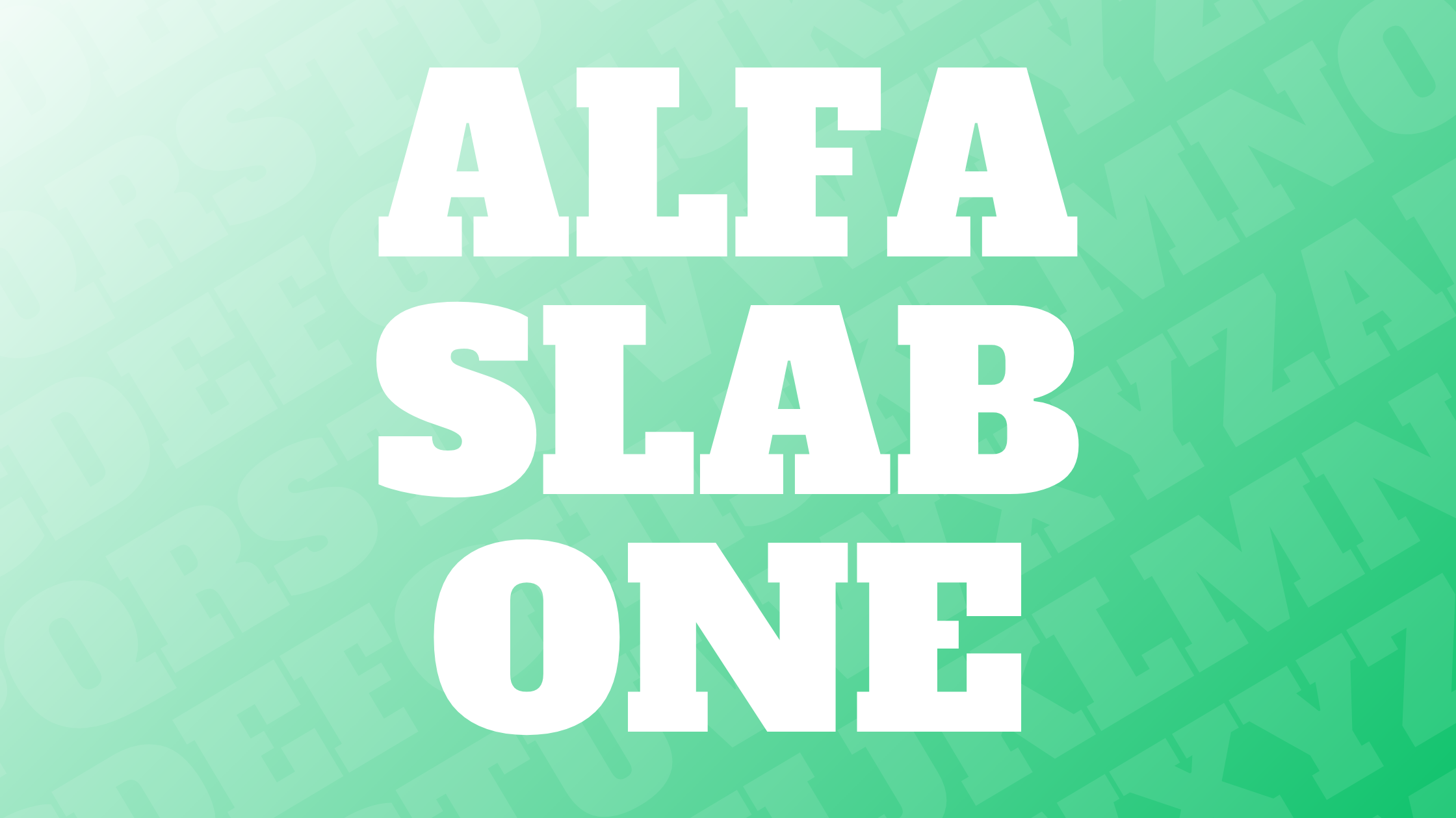
Alfa Slab One is a unique font with a contemporary twist on traditional typeface designs. Originally inspired by the Six-lines Pica Egyptian created by Robert Thorne, this font combines an extreme stem weight with large serifs that help it stand out. Perfect for adding boldness to any design, Alfa Slab One offers a modern feel while maintaining a classic touch.
People interested in typography or graphic design may find Alfa Slab One intriguing due to its distinctive style. Its combination of wide letterforms and sharp serifs makes it ideal for headlines and titles that need to grab attention. Those looking to experiment with font pairings can explore how Alfa Slab One’s bold design complements other fonts.
History of Alfa Slab One
Alfa Slab One is a bold typeface with a rich history. It is a modern take on a vintage style named Six-lines Pica Egyptian. This typeface blends classic elements with contemporary flair.
Design Inspiration
The design of Alfa Slab One traces back to the Six-lines Pica Egyptian style, which was crafted by Robert Thorne in 1921. This style features bold strokes and large serifs, making it eye-catching and distinct. Alfa Slab One keeps these classic features but adds modern elements like extreme stem weight and stem contrast.
Its design is versatile, suitable for projects that require strong visual impact. Whether used in solid colors or with layered textures, this font offers flexibility to designers. It provides a sense of nostalgia while fitting well into current design trends, making it a favorite for creative projects.
Creator of the Font
Alfa Slab One was designed by JM Solé, who sought to revive and modernize a classic typeface style. Solé’s interest was in adapting historical elements to meet contemporary design needs. His reinterpretation stays true to the original inspiration but includes enhancements like gradual terminals with single serifs.
Under Solé’s guidance, the font became known for its visual strength and distinctive look. With a designer dedicated to merging the old with the new, Alfa Slab One stands as a testament to timeless typography, retaining its vintage roots while adapting to present-day aesthetics.
Characteristics of Alfa Slab One
Alfa Slab One is a bold and striking typeface that blends classic and modern design elements. It includes distinctive features like large serifs and extreme stem weight, making it unique among slab serifs. Its design appeals to those seeking a stylish yet retro look.
Typography Style
Alfa Slab One is a contemporary take on the traditional slab serif. This typeface has an extreme stem weight which makes the letters appear thick and sturdy. Designed by JM Solé, the font delivers a strong visual impact with its bold features. The big serifs add to its commanding presence, ensuring it grabs attention right away.
Its design reflects elements from the Six-lines Pica Egyptian style created by Robert Thorne, giving it a vintage touch with a modern twist. The mix of historical and contemporary styles makes this font both nostalgic and fresh. This allows it to work well for headings or any application needing a strong, decorative typeface.
Font Family and Variants
Alfa Slab One is part of the broader slab serif family. It showcases large, flat, block-like serifs that are easy to identify. Despite its boldness, it offers good readability for shorter text segments. There are no known major variants, which keeps its identity very focused.
Its simplicity leaves little room for variations within the family. The design focuses on making letters appear uniform and consistent in weight and style. This consistency makes it an ideal choice for branding and logos where a simple yet impactful statement is needed.
Character Set
The character set of Alfa Slab One includes all basic Latin alphabets, numbers, and common punctuation marks. Its character design stays true to its bold and sturdy nature, providing a cohesive look across different characters.
The font does not offer a wide range of special characters or extended glyphs. It is best suited for applications where the standard Roman alphabet is sufficient. This limitation means it might not be ideal for projects requiring diverse character sets, but it makes it focused and effective in its primary usage scenarios.
Usage of Alfa Slab One
Alfa Slab One is a bold and striking typeface ideal for catching attention. It is used across different platforms, including digital and print media, as well as in brand identities, due to its powerful presentation and versatility.
Digital Media
In digital media, Alfa Slab One shines due to its distinct style and readability. Websites often use it for headers and banners to create a strong visual hierarchy. Its thick lines make it ideal for digital advertisements where grabbing attention quickly is essential. Social media graphics can benefit from its commanding presence, ensuring that key messages stand out in a crowded feed.
This typeface is also suitable for video content. In subtitles or captions, its boldness ensures clarity, even on small screens. Designers rely on Alfa Slab One to maintain visual consistency across various digital touchpoints.
Print Media
In print media, Alfa Slab One is often chosen for headlines and titles. Its strong serif design draws the reader’s eye, making it perfect for magazine covers and posters. Its high contrast enhances visibility, which is crucial for printed materials that need to convey their message at a glance.
For brochures and flyers, Alfa Slab One adds sophistication and flair. It gives printed advertisements a professional and polished look, making them more engaging. Despite its heavy weight, it pairs well with lighter fonts, creating a balanced and pleasing design.
Brand Identity
Brands often use Alfa Slab One to convey strength and confidence. Its unique design elements make it a fitting choice for logos and packaging that aim to leave a lasting impression. This typeface can communicate a brand’s bold vision and values effectively.
Alfa Slab One can be used across various brand materials. For instance, in branding, it highlights a brand’s name or slogan, ensuring it is memorable. By integrating Alfa Slab One into brand visuals, companies create a unified and distinctive look that stands out in a competitive market.
Technical Specifications
Alfa Slab One offers distinct features that make it popular in the design world. It supports various file formats and comes with options for licensing and use.
File Formats
Alfa Slab One is available in several widely used file formats. These formats include TTF (TrueType Font), OTF (OpenType Font), and WOFF (Web Open Font Format).
TTF is favored for its compatibility across different operating systems, making it a common choice for personal and business projects. Meanwhile, OTF provides advanced typographic features, making it ideal for professional design work. WOFF is optimized for web use, ensuring that websites featuring this typeface load quickly. Each format ensures that Alfa Slab One remains versatile for different uses, whether in print or digital media.
License and Availability
Alfa Slab One is free for commercial use, allowing designers the freedom to incorporate it into various projects without licensing fees. This absence of cost makes it accessible for both individual designers and larger companies.
To use the font, users must adhere to certain conditions, such as not selling it as a standalone product. Besides this requirement, one can modify and redistribute the font freely. It is available for download on platforms like Google Fonts, making it easy to access and use. This accessibility, paired with its licensing flexibility, attracts many to the bold appeal of Alfa Slab One.
Comparing Alfa Slab One
Alfa Slab One is known for its bold design and unique take on traditional typefaces. It stands out among similar fonts, and its differences set it apart from other slab serif fonts.
Similar Fonts
Alfa Slab One is a bold and creative font choice that shares characteristics with fonts like Plakat, Cairo, and Ultra. These fonts offer a strong presence and are often used to capture attention in headlines and logos. Plakat, in particular, has similar weight and serif styles, making it a popular alternative for those who like the Alfa Slab One aesthetic.
Cairo also offers boldness but with a slightly different structural style. For those looking for something with the same heavy visual impact, these options can be excellent choices.
Differences from Other Slab Serifs
While Alfa Slab One is based on the Six-lines Pica Egyptian style, it introduces a modern twist with its extreme stem weight and large serifs. Unlike some traditional slab serifs, it incorporates more stem contrast and gradual terminals, making it unique.
Another standout feature is its singular serif, setting it apart from others in its category. This font’s specific design elements create a distinctive look that fits well in contemporary settings, such as advertising and digital media.
These characteristics give it an edge over more classic options, lending a modern touch to any project where it’s used.
Designing with Alfa Slab One
When using Alfa Slab One in design projects, consider its bold and creative features. It is a dynamic font with extreme stem weight and large serifs, making it a strong choice for creating impactful visuals. Below are key aspects to consider while working with this unique font.
Best Practices
Alfa Slab One is best used for headlines, logos, and posters where its bold nature can stand out. Its thick stems and distinctive serifs draw attention, so it’s important to use it in places where you want to make a statement or captivate viewers.
To keep designs balanced, moderation is key. Since Alfa Slab One is quite bold, pairing it with lighter fonts for body text can prevent the design from feeling overwhelming. Using sufficient spacing helps maintain readability, especially in digital formats.
Consider the mood and theme of the project. Alfa Slab One works well in creative fields, such as advertising or entertainment, where a vintage yet modern appeal is desired. Avoid overusing this font in more formal or traditional contexts, as it can be too striking.
Pairing with Other Fonts
Pairing Alfa Slab One with complementary fonts is crucial for visually pleasing designs. Sans-serif fonts, like Arial or Open Sans, can balance its boldness. These fonts bring a cleaner, more understated look, allowing Alfa Slab One to shine without competing for attention.
Serif fonts like Times New Roman can be used when a more classical tone is needed. Mixing styles adds depth to the design.
When selecting fonts to pair, consider the overall color scheme and layout of the project. High-contrast colors can enhance the boldness of Alfa Slab One, while neutral tones can create a more sophisticated balance.
Accessibility Considerations
Choosing fonts for accessibility is crucial in design. Alfa Slab One, with its bold and unique style, brings some special considerations to the table.
The thick and heavy strokes of Alfa Slab One may affect readability for some users. For visually impaired users, fonts with clearer, simpler designs might be easier to read.
Key Accessibility Tips:
- Use sufficient contrast between text and background.
- Ensure proper spacing between letters and lines.
- Consider combining with a more accessible font for body text.
It’s important to remember that no specific typeface requirement exists for web accessibility guidelines. Instead, focus on the overall legibility of the typeface in various contexts.
Alfa Slab One may be best for headlines or titles due to its boldness and emphasis. For paragraphs or smaller text, a simpler font might work better to ensure readability for all users.
Web designers should always test their typography choices with different users. This helps in understanding how effective the font choice is in conveying information clearly.
User Perception and Reception
Alfa Slab One is often seen as a bold and fun choice for designers. Its distinct style captures attention with its strong and chunky appearance. Many users appreciate its vintage feel mixed with a modern twist. The font stands out in posters, headlines, and other creative projects.
Users frequently comment on its dramatic yet playful look. The thick serifs and heavy weight provide a sense of impact. It’s ideal for conveying messages with a touch of personality and flair. Designers find it especially effective for making text pop in graphic design work.
Some designers note that it can be challenging to use for longer text, as its bold style may dominate the page. They recommend using it sparingly, in headings or titles, where it can truly shine. This approach helps maintain readability while showcasing the font’s unique characteristics.
Here’s a quick look at some common reactions to Alfa Slab One:
- Visual Impact: Bold and attention-grabbing
- Style: Vintage with a modern touch
- Usage: Best for headlines and short text
The Alfa Slab One font is often used in various digital and print media. Both designers and typographers enjoy experimenting with it. It offers a unique way to convey strong and memorable messages, making it a popular choice for those looking to create standout designs.