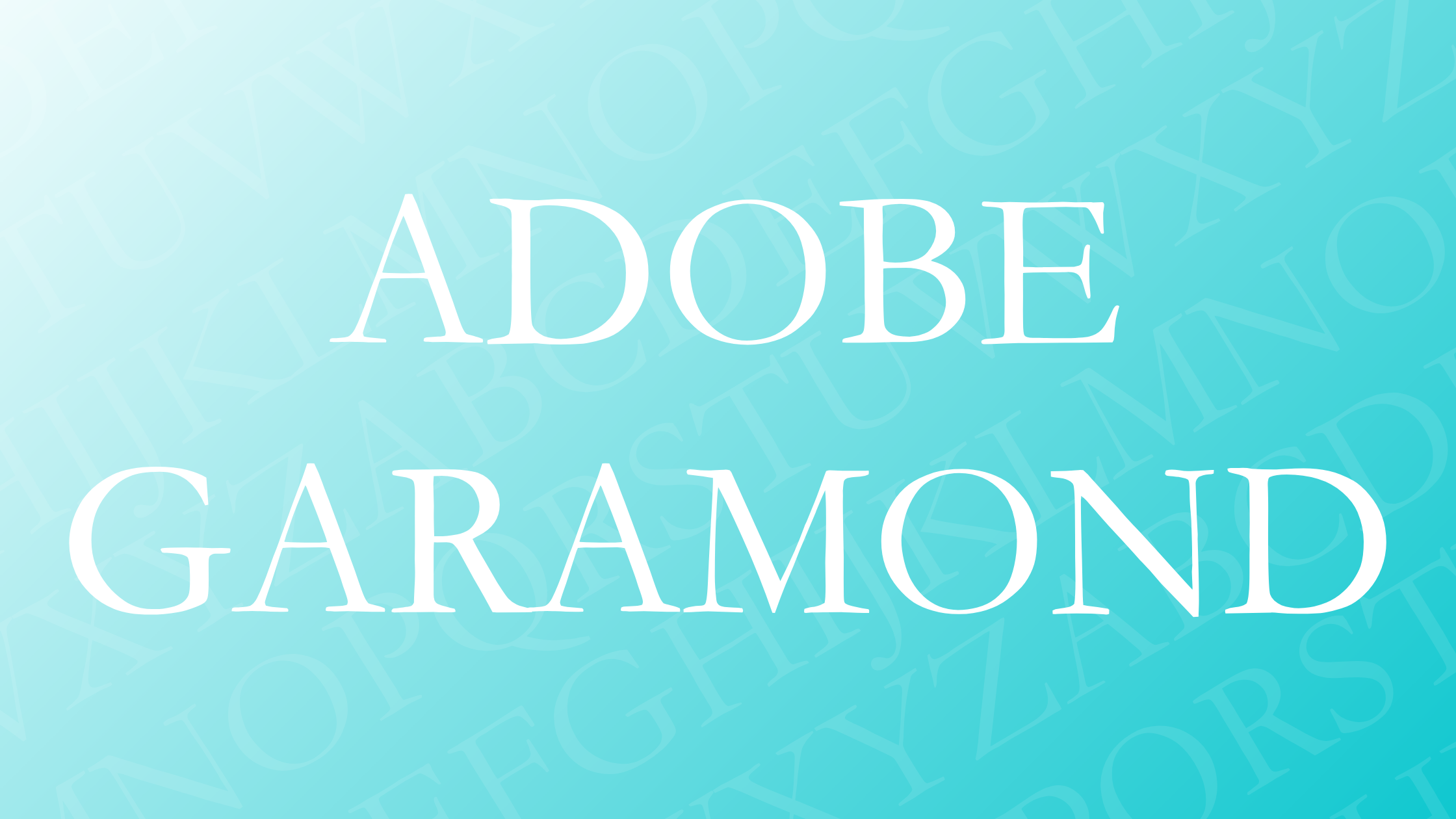
Adobe Garamond stands as a digital revival of the classical Garamond typeface, originally created in the 16th century by Claude Garamond. This typeface is renowned for its elegant design and has become a staple in the world of typography and design. Adobe Garamond is celebrated for its timeless aesthetic, exceptional readability, and its adaptability in both print and digital formats.
Designed by Robert Slimbach, Adobe Garamond is part of the Adobe Originals collection. It draws inspiration from historical sources, bringing a classic feel to modern design. The font has played a significant role in typography, making it a favorite for designers who appreciate its historical significance and versatility.
The charm of Adobe Garamond lies in its ability to bring sophistication and clarity to any project. It is often used in various applications, from books to web design, because of its classic yet contemporary appearance. For those interested in exploring traditional typefaces with modern relevance, Adobe Garamond is an appealing choice.
History of Adobe Garamond
Adobe Garamond is a classic typeface known for its elegance and readability. It was created as a digital interpretation of the traditional fonts crafted by the renowned 16th-century engraver Claude Garamond. This modern adaptation aimed to preserve the original style while enhancing it with contemporary design needs.
The font was released in 1989 and stands as Adobe’s first historical revival. It was designed by Robert Slimbach, who carefully studied Garamond’s work to bring authenticity to his version. The goal was to capture the essence of the Renaissance style and adapt it for modern use.
Adobe Garamond features a blend of roman and italic styles. These styles were inspired by the earlier works of Claude Garamond and Robert Granjon. This combination creates a harmonious and visually appealing font, making it ideal for both print and digital media.
Since its release, Adobe Garamond has been widely used in design and publishing. It is known for its versatility and can be found in a variety of projects, from books to logos. Its timeless appeal continues to make it a favorite choice among designers worldwide.
For more details, you can read about the elegant old-style look of Adobe Garamond, which suits many professional projects.
Design Characteristics
Adobe Garamond is known for its classical elegance and attention to historical detail. The design reflects a blend of traditional serif style with modern precision, making it a favorite for those seeking both aesthetic appeal and clarity.
Serif Style
Adobe Garamond features a classic serif style that evokes the original work of Claude Garamond from the 16th century. The serifs in this typeface are fine and slightly rounded, lending an elegant and historic feel. These characteristics make it suitable for designs that aim to appear traditional or formal. The consistent stroke weight enhances its timeless aesthetic, creating a seamless reading experience. Additionally, the refined serifs help guide the eye smoothly across the text, supporting continuous reading in long passages.
Letterforms and Geometry
The letterforms of Adobe Garamond are distinguished by their balanced proportions and smooth curves. These shapes are inspired by the handwritten style of the Renaissance, adapted into a digital format for clarity. The x-height is moderately sized, which contributes to the legibility of the font. The contrast between thick and thin strokes is subtle, yet effective, adding a visual rhythm to the text. The italics introduce an angle that is both graceful and fluid, bringing dynamism without disrupting the overall structure. This combination invites effortless reading in various digital and print applications.
Legibility and Readability
Adobe Garamond excels in legibility, which is crucial for prolonged reading. The font’s design focuses on maintaining clarity in densely packed text, such as in novels or detailed reports. Each character is distinct, helping readers distinguish between letters like ‘i’ and ‘l’. This reduces eye strain and makes the text accessible for a wide audience. The even spacing balances contrast, preventing visual clutter. As a result, Adobe Garamond is a popular choice for book and editorial design, where clear communication is paramount. Its design ensures that readers are not distracted by font intricacies but are instead fully engaged with the content.
Usage and Applications
Adobe Garamond is a versatile typeface that works well both in print and digital formats. Its elegant style and readability make it ideal for a wide range of applications, from books and magazines to websites and digital designs.
Print Media
Adobe Garamond shines in print media due to its classic and timeless look. Designers often choose it for books because it enhances readability, especially in long texts. The typeface adds a touch of sophistication to magazines and newspapers, creating an inviting reading experience.
Brochures and posters also benefit from the elegant and professional aura that Adobe Garamond brings. Its serifs provide a traditional feel that complements historical and literature-focused publications. Precision in its design ensures consistent quality in print outputs, making it a reliable choice for publishers worldwide.
Digital Media
In digital media, Adobe Garamond offers clarity and elegance. Its design makes it suitable for user interfaces, where readability is key. Websites that aim for a classic or professional look often incorporate this font for headings and body text. The font adapts well to different screen sizes, maintaining its aesthetic appeal across devices.
Additionally, Adobe Garamond is used in branding for a polished look. Logos and digital advertisements benefit from its timeless style. Available through Adobe Fonts, the font remains a favorite for those seeking to pair digital readability with classical elegance.
Font Variations and Weights
Adobe Garamond offers a variety of weights and styles to suit different design needs. This makes it a versatile typeface that can create a clear typographic hierarchy in any project.
One of the notable features of Adobe Garamond is its multiple weights. These include Regular, Semibold, and Bold. Each weight has matching italic styles, providing more options for emphasis in text.
Here’s a quick look at the available options:
- Regular
- Regular Italic
- Semibold
- Semibold Italic
- Bold
- Bold Italic
This wide range of styles enhances the usability of Adobe Garamond in both print and digital media. It allows designers to maintain a consistent look while also emphasizing certain elements. This adaptability has made it a popular choice for a variety of uses, from books to web content.
Adobe Garamond’s flexibility is bolstered by its compatibility with OpenType applications. This compatibility ensures that it can be used in modern design software, adding to its appeal for contemporary designers.
Typography in Adobe Garamond
Adobe Garamond is a classic serif font, known for its elegance and readability. This typeface was designed by Robert Slimbach and is a digital revival of the works of Claude Garamond and Robert Granjon. It’s widely used in books, magazines, and other print media due to its traditional yet versatile style.
Key Features:
-
Serif Style: Garamond fonts have a serif design, which means they have small lines or embellishments at the ends of letters. This adds a timeless and sophisticated touch to printed materials.
-
Legibility: The font is known for its clear and readable letters. This makes it ideal for long texts, such as novels or informative content.
Adobe Garamond shows particular attention to detail in its letterforms. The curves and line weights create a harmonious balance that is pleasing to the eye. This level of careful design contributes to its continued popularity in typography today.
When it comes to pairing, Adobe Garamond works well with modern sans-serif fonts. A popular choice is to pair it with fonts like Fibon or George Sans. These combinations offer a nice contrast and add a contemporary twist to the classic Garamond style.
Adobe Garamond is revered in modern design. Its roots in 16th-century typography combined with digital enhancements make it a font that seamlessly blends tradition with modernity, offering both beauty and functionality.
Licensing and Availability
Adobe Garamond is a popular typeface designed by Adobe. It is part of Adobe Fonts, which requires a subscription for access. The font is not available for free download or use. Users must purchase or subscribe to access the full family of styles.
Licensing Options:
- Adobe Creative Cloud: This subscription includes Adobe Garamond, along with many other fonts, for desktop and web use.
- Standalone Purchase: Some versions might be available for individual purchase, but this needs to be confirmed with specific vendors.
If you plan to use Adobe Garamond in a publication, like a book or digital document, appropriate licensing is required. This ensures that you are legally using the font according to Adobe’s guidelines. Visit the Adobe Fonts Licensing FAQ for more details.
Some people may inquire about using Adobe Garamond in products they sell, such as books. It’s important to have a proper license for commercial use. For instance, using it in a printable document created on a Macbook with Pages requires checking that your licensing covers this usage. Check Adobe’s EULA for specifics.
In short, before using Adobe Garamond, verify your subscription or purchase terms. Correct licensing ensures compliance and access to all font features.
Comparisons with Other Serif Fonts
Adobe Garamond stands out in the world of serif fonts due to its unique history and design. This section looks into how it compares to other popular serif fonts, examining both similarities and distinctions.
Similar Fonts
Adobe Garamond shares features with several serif fonts, including Baskerville and Georgia. Baskerville, much like Garamond, is renowned for its elegance and readability. Both fonts offer a classic feel, making them ideal for formal texts and books. Another font, Georgia, is often grouped with Garamond for its timeless appeal.
In contrast, some fonts like Fibon Sans offer a modern twist while still pairing well with Garamond, enhancing its versatility when used together. Fibon Sans is low in contrast and highly legible, perfect for dynamic designs. These similarities in design elements make Garamond a versatile choice for many applications. By blending it with other fonts, designers can achieve a wide range of styles from historical to contemporary.
Differences from Other Garamond Variants
Adobe Garamond can be distinguished from other Garamond variants like Garamond Premier Pro by several features. Adobe Garamond was digitized in 1989, and while it maintains the classic design of the sixteenth-century original by Claude Garamond, it has a few modern tweaks.
Garamond Premier Pro, revised later, offers more refined details and adaptations for digital screens. This makes Adobe Garamond more suitable for a broader range of projects. The Premier Pro is considered more elaborate, adding to the historical feel, but Adobe Garamond is often chosen for its simplicity and adaptability. These differences can impact the choice between these fonts based on the project’s requirements.
Technical Specifications
Adobe Garamond is a classic serif typeface that features both roman and italic styles. It was meticulously designed for readability and elegance. The typeface was created by Robert Slimbach for Adobe Originals.
Weights and Styles:
- Regular
- Italic
- Bold
- Bold Italic
Formats Available:
Adobe Garamond is available in several digital formats. These formats are commonly used in desktop publishing and web design.
- OpenType (.otf)
- TrueType (.ttf)
- Webfont formats
Language Support:
The typeface supports a wide range of languages. It includes characters for many Latin-based languages, making it versatile in different textual contexts.
Design Features:
Adobe Garamond includes distinct features such as old-style figures, small caps, and ligatures. These elements contribute to its historic and elegant appeal.
- Old-style figures: Characters designed to blend well in blocks of text.
- Small Caps: Smaller uppercase letters that match the x-height of lowercase letters.
- Ligatures: Special character combinations for improved readability (e.g., “fi”, “fl”).
Each of these features plays a role in making Adobe Garamond a go-to choice for book publishing and sophisticated design projects. It retains the historical essence of Claude Garamond’s original work while providing modern typographic enhancements.