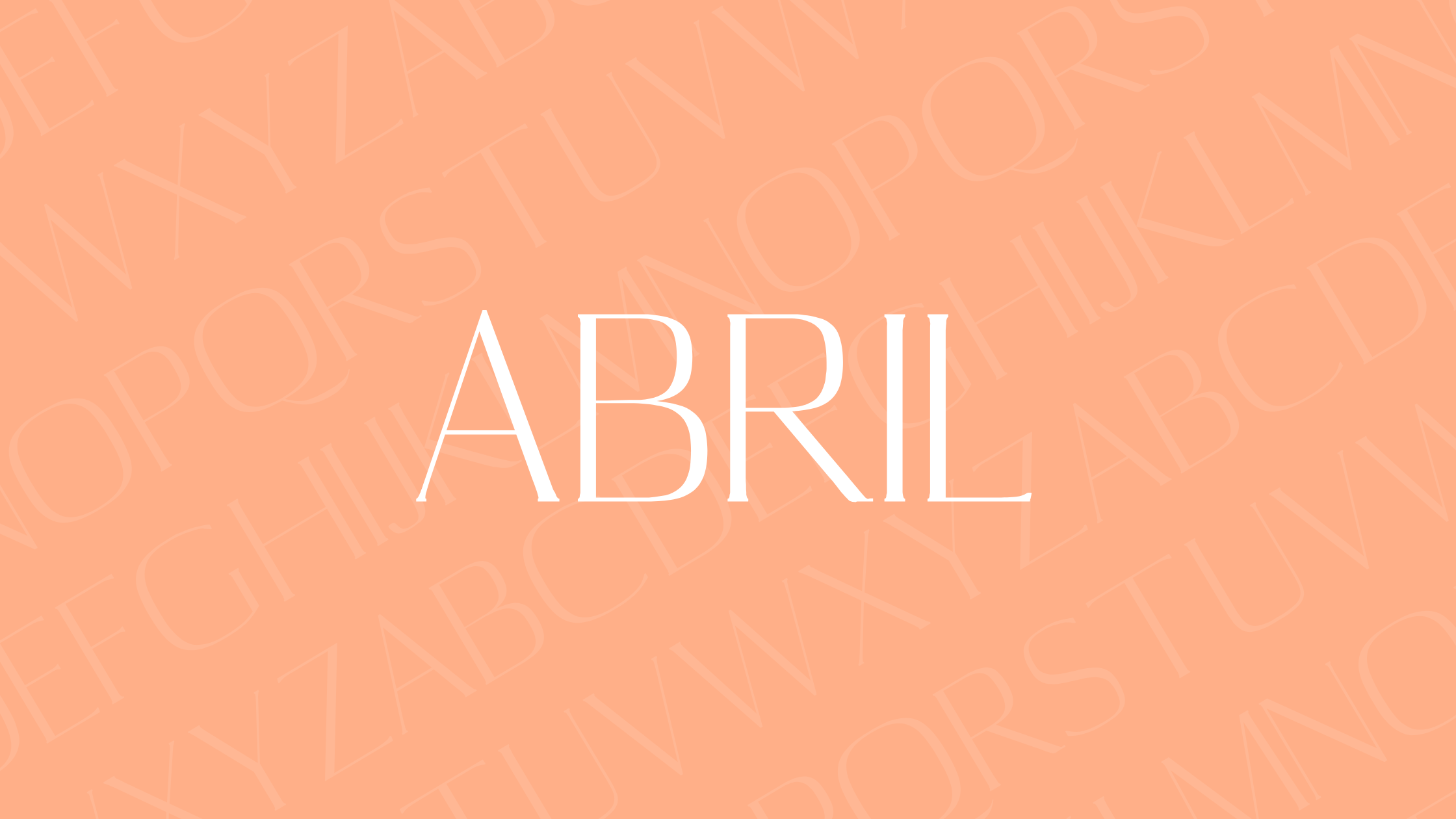
Abril Display is a modern serif typeface known for its elegant and versatile design. Created by Veronika Burian and José Scaglione, this font captures the spirit of classic newsfaces with a contemporary twist. Abril Display offers a strong presence without being overwhelming, making it an excellent choice for both headlines and body text.
With various styles and weights, Abril Display suits different moods and themes. It is particularly appreciated for its balance and readability, which is why many designers use it in both digital and print media. The Abril family includes several text and display weights that ensure consistency across different applications.
Users looking to enhance their design projects will find Abril Display to be a compelling option. Its adaptability shines in branding, advertising, and editorial designs. Learn more about its unique qualities and try fonts for creative projects.
History of Abril Display
Abril Display is an innovative typeface that combines traditional influences with modern design elements. It is part of the larger Abril family, known for its versatility and elegance in both text and display uses.
Design Philosophy
The design of Abril Display draws inspiration from 19th-century typefaces, offering a high-contrast style that stands out in modern typography. Created to serve as a bridge between traditional and contemporary designs, it emphasizes readability and aesthetic appeal. The typeface excels in various applications, from print to digital media, ensuring clarity and boldness in text appearance. Its distinctive features reflect a careful balance between classic serif traits and modern typographic methods, making it suitable for headlines and titles.
Creator Background
Abril Display was designed by Veronika Burian and José Scaglione, founders of TypeTogether in 2006. Burian and Scaglione are renowned for their creative vision and commitment to offering practical design solutions. Their collaboration on Abril Display showcases their expertise in designing typefaces that are both functional and visually striking. TypeTogether’s mission is to produce innovative typographic designs that address global communication needs while maintaining high aesthetic standards. Their work on Abril Display reflects their dedication to creating fonts that blend tradition with contemporary design principles, contributing to the typeface’s popularity among designers worldwide.
Font Characteristics
Abril Display is a typeface celebrated for its distinct serif style, unique letterforms, and high readability. Derived from the larger Abril font family, it blends traditional influences with modern needs, making it appealing for a variety of uses in design and print.
Serif Classification
Abril Display belongs to the serif category, more specifically a display serif typeface. Serifs are the small lines or strokes regularly attached to the end of larger strokes in letters. This gives Abril Display its classic and timeless appearance. These characteristics often make serif fonts look elegant and formal.
The serif style of Abril Display is particularly noticeable in its high contrast between thick and thin strokes. This contrast helps to define its visual appeal, making it an excellent choice for titles, headlines, and other prominent text.
Letterform Features
The letterforms of Abril Display are distinctive due to their elegant curves and bold design. Each letter has been carefully crafted to ensure clarity and visual interest. The high contrast in stroke weight adds a sense of drama to the typography.
Abril Display’s boldness does not compromise its elegance. The curves are smooth and graceful, providing a balance between strength and finesse. This balance is achieved through meticulous design elements that enhance the font’s versatility for different design applications.
Readability
Readability is a key strength of Abril Display. The font’s balance between boldness and elegance allows it to capture attention without overwhelming the reader. This feature makes it well-suited for both print and digital media.
Abril Display’s readability is further enhanced by the consistency in its stroke contrasts and spacing. These aspects ensure that letters are easily distinguishable from one another, even in larger text sizes. Its design allows for comfortable reading, which makes it suitable for various uses, including long-form text and diverse editorial needs.
Usage Guidelines
Abril Display is a versatile and eye-catching font, making it excellent for certain types of projects. It works best at larger sizes and pairs well with certain fonts to create appealing designs.
Optimal Size for Readability
When using Abril Display, it shines most at larger sizes. Its style is best suited for headlines, titles, and other prominent text elements. Its bold design and high contrast make it stand out, ensuring that important text captures attention.
Small sizes can make it hard to read due to its intricate details. Keeping the font size large helps maintain readability and visual impact. Designers often choose this font for projects like posters and advertisements where grabbing attention is crucial.
Pairing with Other Fonts
Pairing Abril Display with other fonts can enhance a design’s overall aesthetic. For example, it pairs well with simpler sans-serif fonts. This combination balances Abril Display’s ornate features.
A popular choice is to use Abril Display for headlines, while a clean sans-serif like Helvetica or Arial serves the body text. This offers a nice contrast and keeps the design engaging yet readable. Careful pairing enhances the intended message, allowing each element to complement the other effectively.
Technical Specifications
The Abril Display font is well-regarded for its versatility and style. It offers multiple file formats and straightforward licensing options, making it accessible for designers and businesses alike.
File Formats and Compatibility
Abril Display is available in a variety of formats that ensure compatibility across different platforms and software. Common formats include OTF (OpenType Font) and TTF (TrueType Font). These formats are widely supported by most graphic design programs like Adobe Illustrator and Photoshop, allowing for easy integration into design projects.
Abril Display is also usable in web design through webfont formats including WOFF and WOFF2. These formats help improve loading times and optimize performance on websites. This cross-platform availability makes Abril Display a flexible choice for both print and digital media applications.
Licensing and Usage Rights
Licensing for Abril Display is designed to accommodate a range of users from individual designers to large enterprises. The font is typically available under a commercial license. This allows for its use in various professional settings, including advertising, product packaging, and branding materials.
Additionally, the font might be available under the SIL Open Font License. This license type permits free usage for personal and academic projects. It’s important for users to verify the specific terms on the vendor’s website or purchase agreement to ensure proper usage without violating any conditions.
Visual Examples
Abril Display demonstrates its versatility through various media formats. Display fonts are crucial for grabbing attention in both print and digital settings due to their bold and eye-catching styles.
Print Media
In print media, Abril Display excels in creating striking headlines and titles in magazines, newspapers, and posters. Its bold, high-contrast design draws readers in, making it ideal for advertisements and covers. The serif style adds a touch of elegance, enhancing visual appeal. Designers often use Abril Display for fashion magazines, where style and readability are key. Its design also works well for brochures and flyers, providing a classic yet contemporary look. These qualities make Abril Display a favorite for print projects that need to stand out.
Digital Media
In digital media, Abril Display is effective for branding, web design, and social media graphics. The font’s high-contrast features ensure visibility on screens, particularly for headlines and banners. Websites often use it to create a chic and modern aesthetic, appealing to a tech-savvy audience. Abril Display is also used in digital advertising to capture attention quickly. Designers might pair it with simpler fonts for body text to maintain readability. Its versatility allows it to adapt to various online platforms, ensuring that digital content remains engaging and visually appealing.
Accessing Abril Display
Abril Display can be accessed through various platforms and methods. Users can find this font in major font libraries and retailers, and it is also available for web integration.
Font Libraries and Retailers
Abril Display is available on several reputable font libraries and retailers, making it easy for users to locate and purchase. One popular option is Adobe Fonts, where users can sync the font with their Adobe Creative Cloud subscription. Additionally, the font can be found through TypeTogether, where users can try, buy, and download it.
Some platforms offer the font under different licenses, such as the SIL Open Font License on Fonts in Use. This flexibility allows designers to choose the best option for their needs.
Webfont Integration
For those interested in using Abril Display on websites, the font can be integrated through web font services. Platforms like Adobe Fonts provide easy web use integration, allowing designers to embed the font in their projects with a few clicks. This is useful for web designers looking to maintain a consistent design across digital media.
Abril Display’s strong presence makes it an excellent choice for headlines and other prominent text on webpages. The variety of styles allows for creative expression while ensuring readability and aesthetic appeal. Webfont integration ensures that the font loads smoothly across different devices, enhancing user experience.